Custom gradient border in Webflow
Create borders that pop with a gradient background and padding.

Style elements on your site using beautiful gradients. Combining the power of gradients and padding, you can style borders with a fully customizable gradient in the Webflow Designer.
In this lesson, you'll learn how to add a gradient border to your elements doing the following:
- Make a button from a a Link block
- Set a linear gradient background
- Match background color
- Add padding
Make a button from a Link block
Create a button so you have something to add the gradient border to.
- Drag a Link block into the document
- Drag a text block and drop it inside the link block
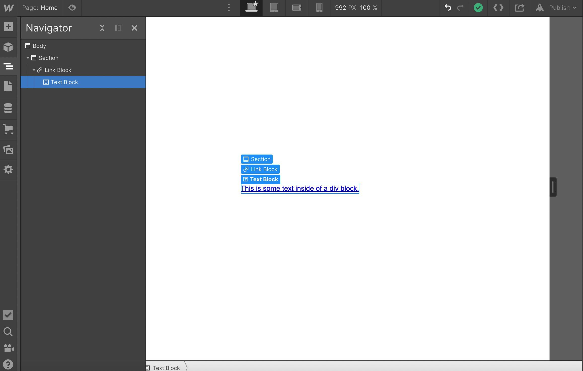
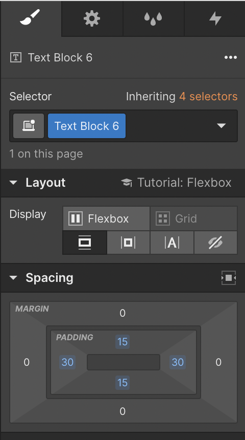
Give the text block a button shape with padding.
- Select the text block
- Open Style panel > Spacing
- Set the left and right padding to 30px
- Set the top and bottom padding to 15px
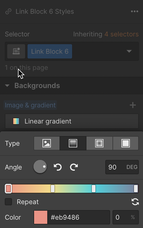
Set a linear gradient background
Great! Now you have a button to work with, set up the gradient border on the Link block.
- Open Style panel > Backgrounds
- Click the Image & gradient "plus" icon
- Click Linear Gradient to set up the background gradient
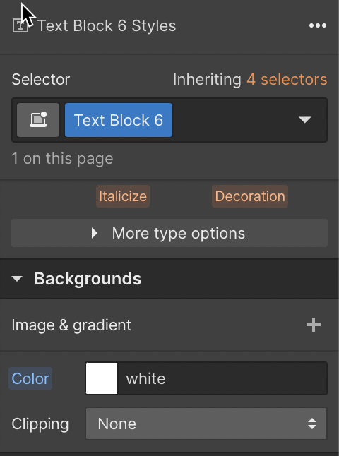
Match the background color
Apply a background color to the text box that matches the page background on the text block.
- Open Style panel > Backgrounds
- Set the background color of the text block to match the background color of the page (e.g., white)
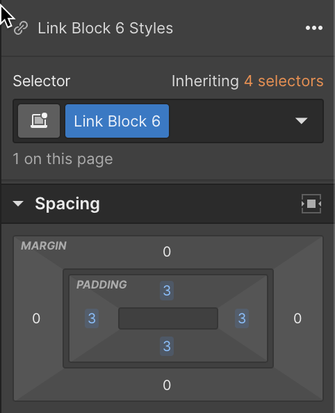
Add padding
Show the gradient by adding padding to the link block.
- Open Style panel > Spacing
- Set the same padding on all four sides
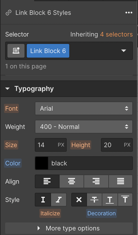
Change the typography settings on the Link block to make the link look more like a button.
- Open Style panel > Typography
- Remove the underline decoration from the link block
- Change the font color to black
Read more about typography.
Finish the button off by adding a border-radius to both the Link block and text block to round the button.
Read more about borders.
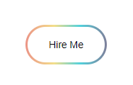
And that's it! A button with a gradient for a border is sure to grab the attention of your site visitors.